
Client Work
Information Wesbite
Solo Ux & UI Designer
Figma
Photoshop
Illustrator
Dublin West SDA Church, a growing church, reached out to me to create a digital presence to tackle the problem they have with outreach and communication within the church.
“Create a digital presence of the Church, an all in one hub for information.”
I wanted to design a website which met the requirements and needs of what the client requested. My main goal will to check the KPI (visiting users) of the website and see it with a substantial amount of visiting users.
Solving the Church's problem of having no digital presence, communication and outreach is easy to do. The real challenge of this was to how to make this church stand out and cater to other peoples wants and needs. Knowing peoples established relationships and viewpoints towards religion and how we can accommodate them.
Designed a seamless website that is easily accessible for anybody, while still maintaining the religious values.


Dublin West SDA Church is a growing church but has been having problems with communication and outreach.
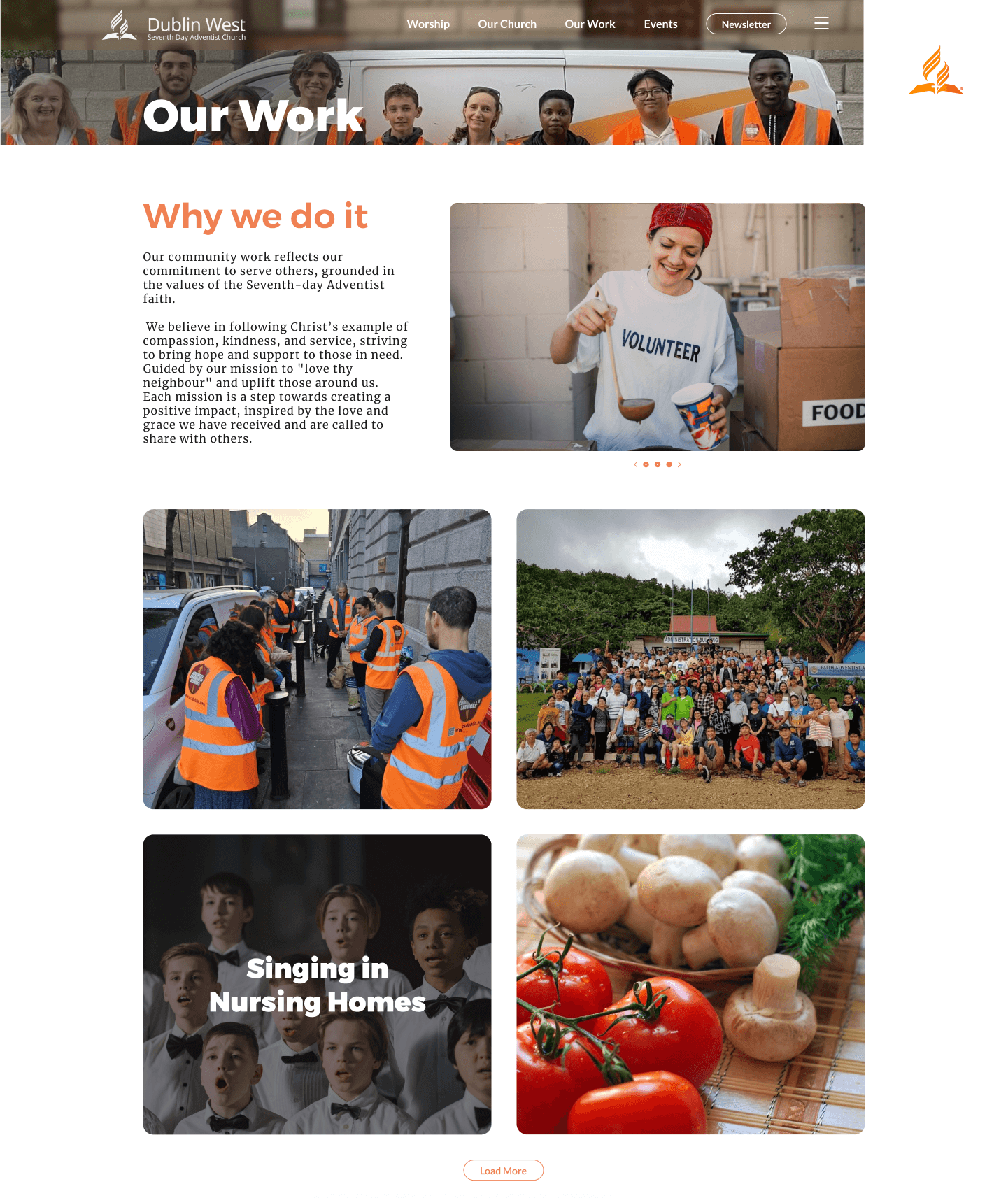
Through the years the most present form of outreaching has been word of mouth. This could be through friends of the members or by strangers witnessing the work of the church such as feeding the homeless.
All information is also being relayed in person during the service of the Church or a random Facebook group chat that's not well maintained.
To define fully the problems the Church are having I decided to make an affinity map. Through Affinity mapping I created 4 clear different problems.
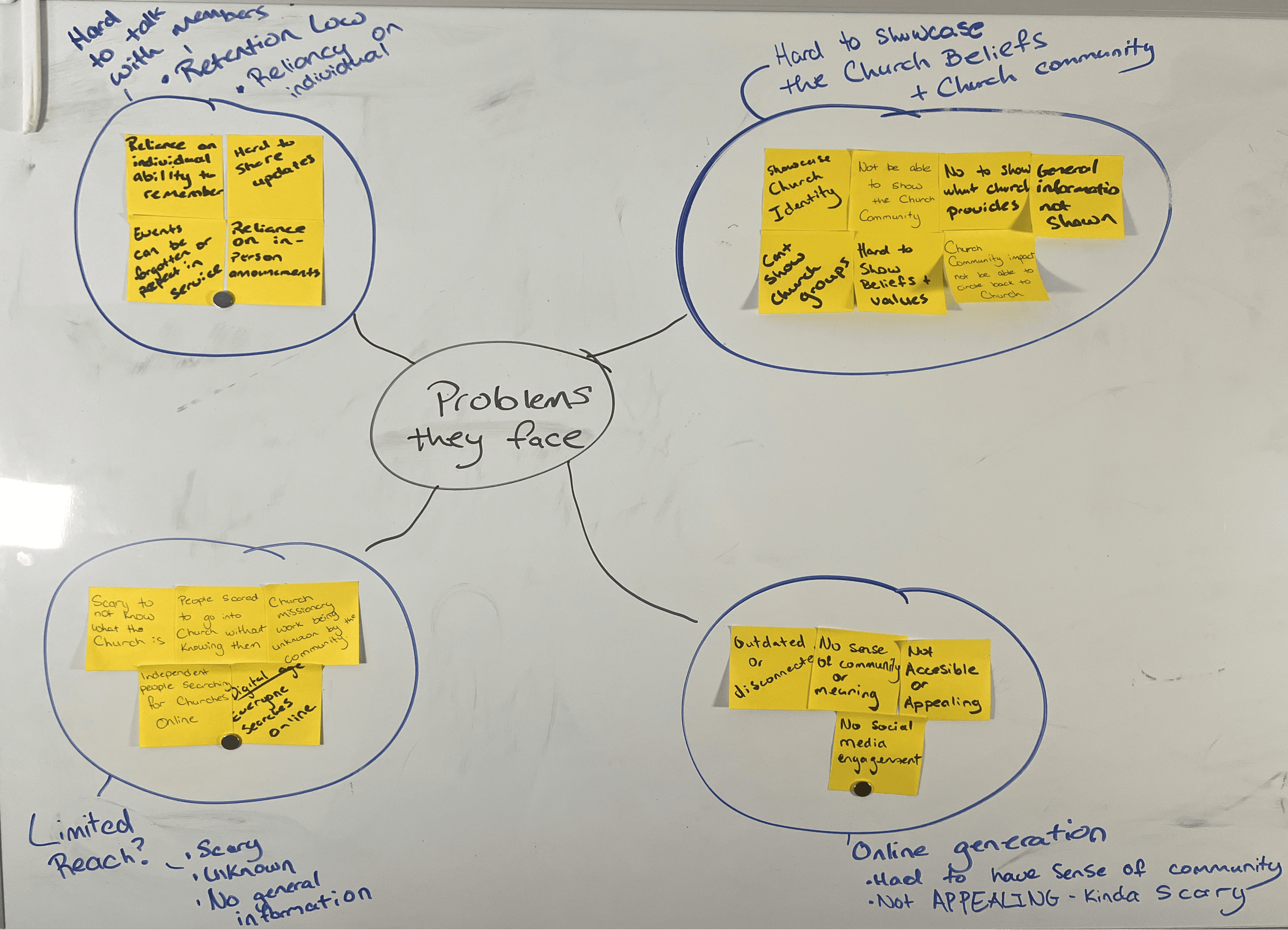
Limited Reach
Reduced credibility
No information - scared of unknown
Outdated in Online Generation
Not accessible or appealing
No social media presence
No sense of community
Hard to communicate
Restricted way of communication
Reliance on individuals
Relicance on in - person information
Hard to showcase Church & Values
No church identity
Cant showcase community work
Cant show what groups, initiatives they provide
Understand Relationships with Religious Groups
Learn Users Values when researching Religious Groups
Learn what users initially search for when looking at Religious Groups
Learn different reasons a person would visit a Church Website
Needs of members and non members
The goal of this research is to understand the relationship between different demographics towards religious communities and their values that resonates with what they would want to see in a Church
Research is based on my own conducted surveys/interviews and studies published online to the public, studies include :
Barna Group. (2020). “State of the Church 2020.”
Pew Research Center. (2015). “America’s Changing Religious Landscape.”
NORC’s General Social Survey
Gen - Z
This demographic has the least religiously affiliated - only 37%. Traditional practices is not interesting to them.
Millennials
This demographic is in the middle, they have been declining but has had an 18% increase attendance since 2019.
Older Adults
This demographic is the majority of
church attendees.
Targeting the younger generation such as Gen - z and Millennials is the solution, since its the group of people the church is having the most complications.
The target audience are split to 2 broad groups.
Part of the Church (Older Adults)
Not Part of the Church (Gen-Z & Millennials)
Gen - Z
Authencity
Transparency
Social Justice
Social Action
Community
Diversity
Personal
Millennials
Inclusivity
Acceptance
Spiritual growth
Guidance
Community engagement
Casual
Older Adults
Stability
Tradition
Spiritual guidance
Fellowship
Giving back
The goal is to see the user needs and user pains, collected from 3 groups, but 2 broad groups (members & Non - Members
I also conducted a sub survey/interviews with Members only, to see their problems with having no digital presence.
Survey consists of 31 users. Split into 3 groups.
Group 1 - Church Members (10 Users)
Group 2 - Members who found the Church (7 Users)
Group 3 - Non Members who searched/searching for Church's (14 Users)
Group 1
Group 2
Group 3
Personal Growth
Have a place to go to deepen there personal growth within the church.
Recollection
Somewhere to see events and reminders.
Information
Place to show information about the church.
Low Pressure
Have methods to let users connect with the church without fully diving in with so much pressure.
Disorganized
Too many groups and people to contact
Difficult to share
Sharing beliefs are hard to do without any evidence to backup what they are saying.
Uncomfortable
To know the church is to go in. This might be too much pressure for users, especially in areas they never been
Unknown
Having no prior knowledge of the church can create users be resilient to explore more.
Users from surveys and interviews were tasked to fill, rounded up to average
Location
Service Timeline
Social Aspect of the Church
Time of Service
What the Church looks like
Based on observation and interviews with users I wanted to see motivations of users to access the website.
Separated by 2 groups again (members & Non-Members.)
Looking for a church near them.
Needs a reminder of events.
Wondering what the service will be next week.
Planning to join one of the groups.
Saw an SDA hosted evented and was interested.
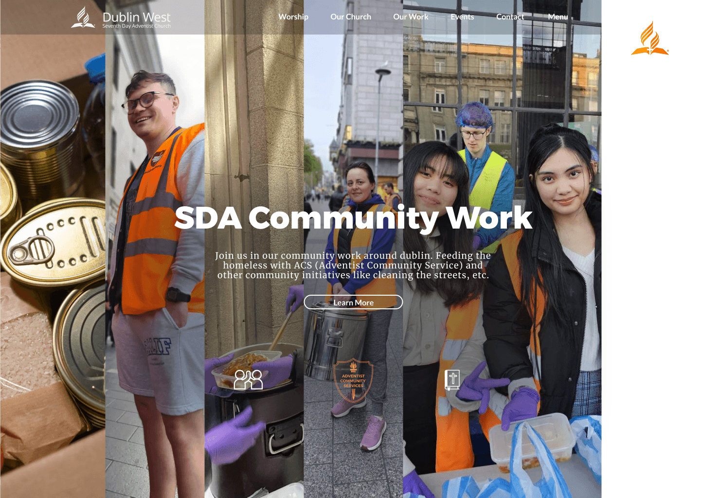
Saw community work held by SDA in town.
Friend recommends them a church.
Curiosity in the churches near them.
Directions to the church
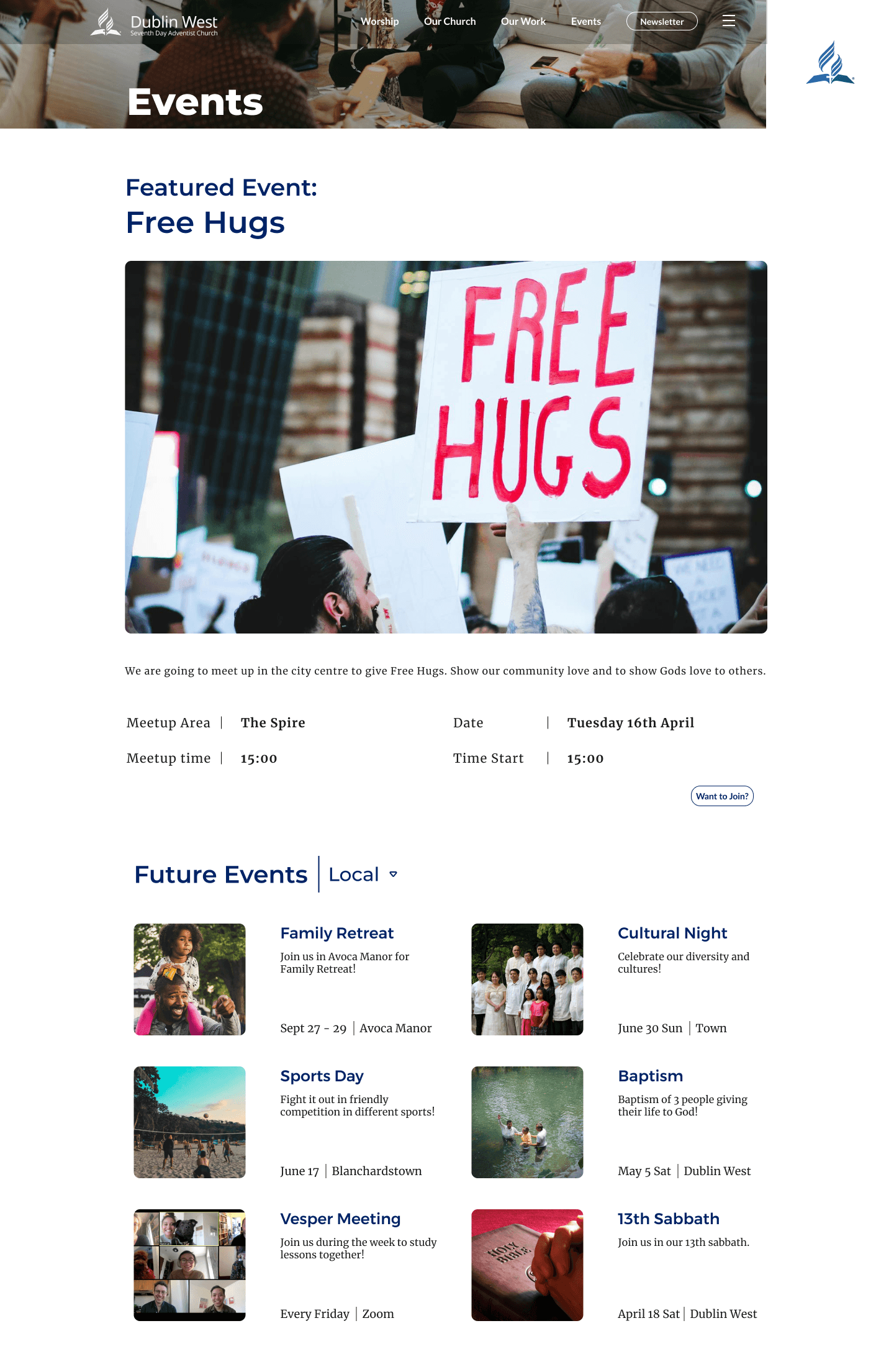
Events Page
Service information.
Groups available in the church.
Information about the event.
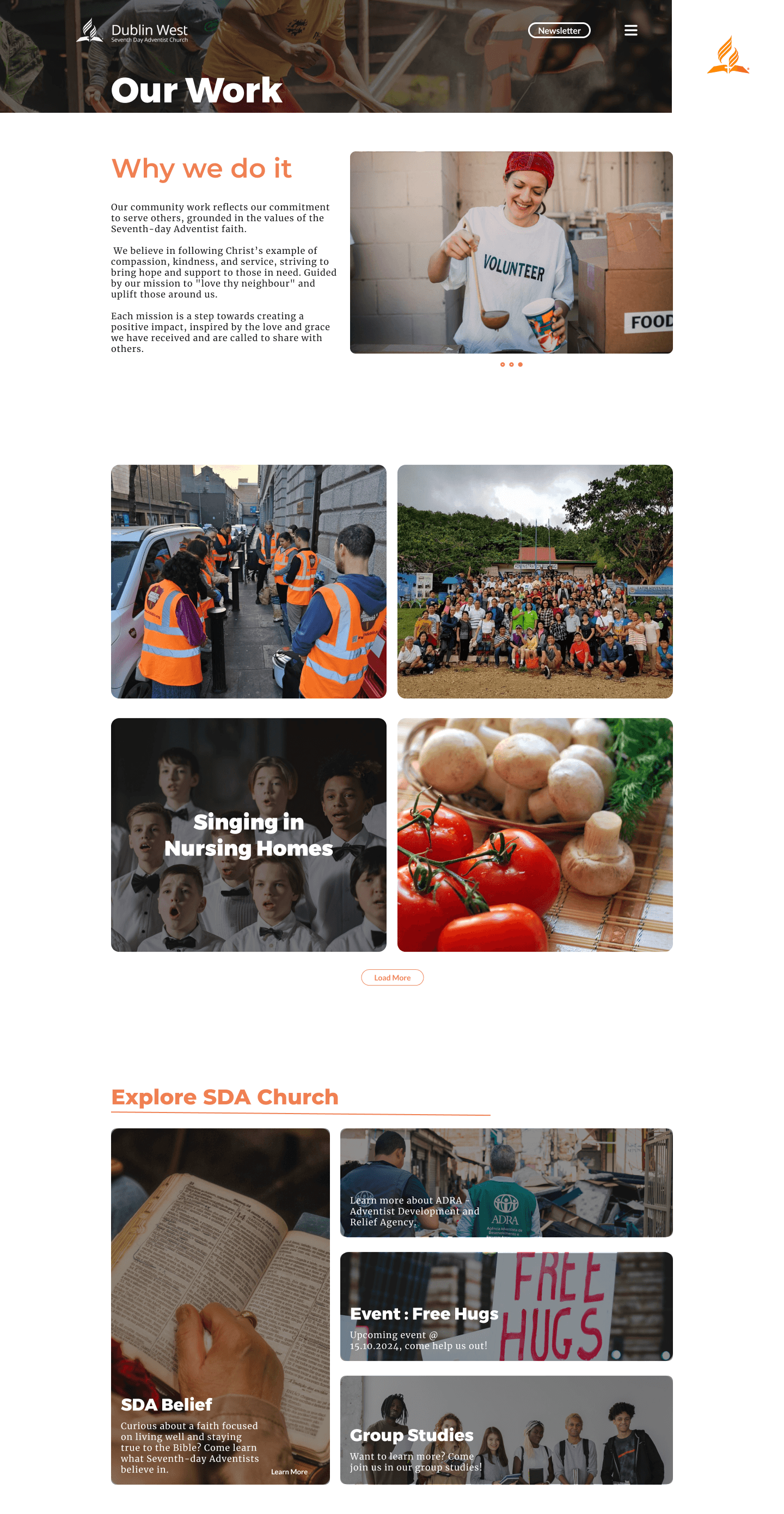
Information about the community work.
What the church is like, the people.
Information about the churches beliefs.
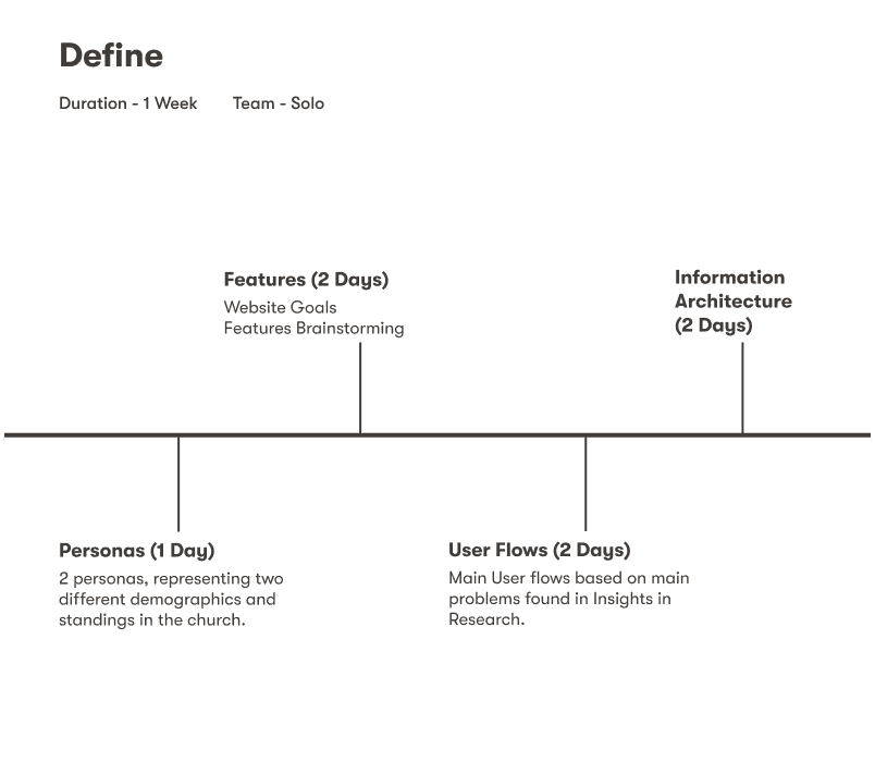
Define
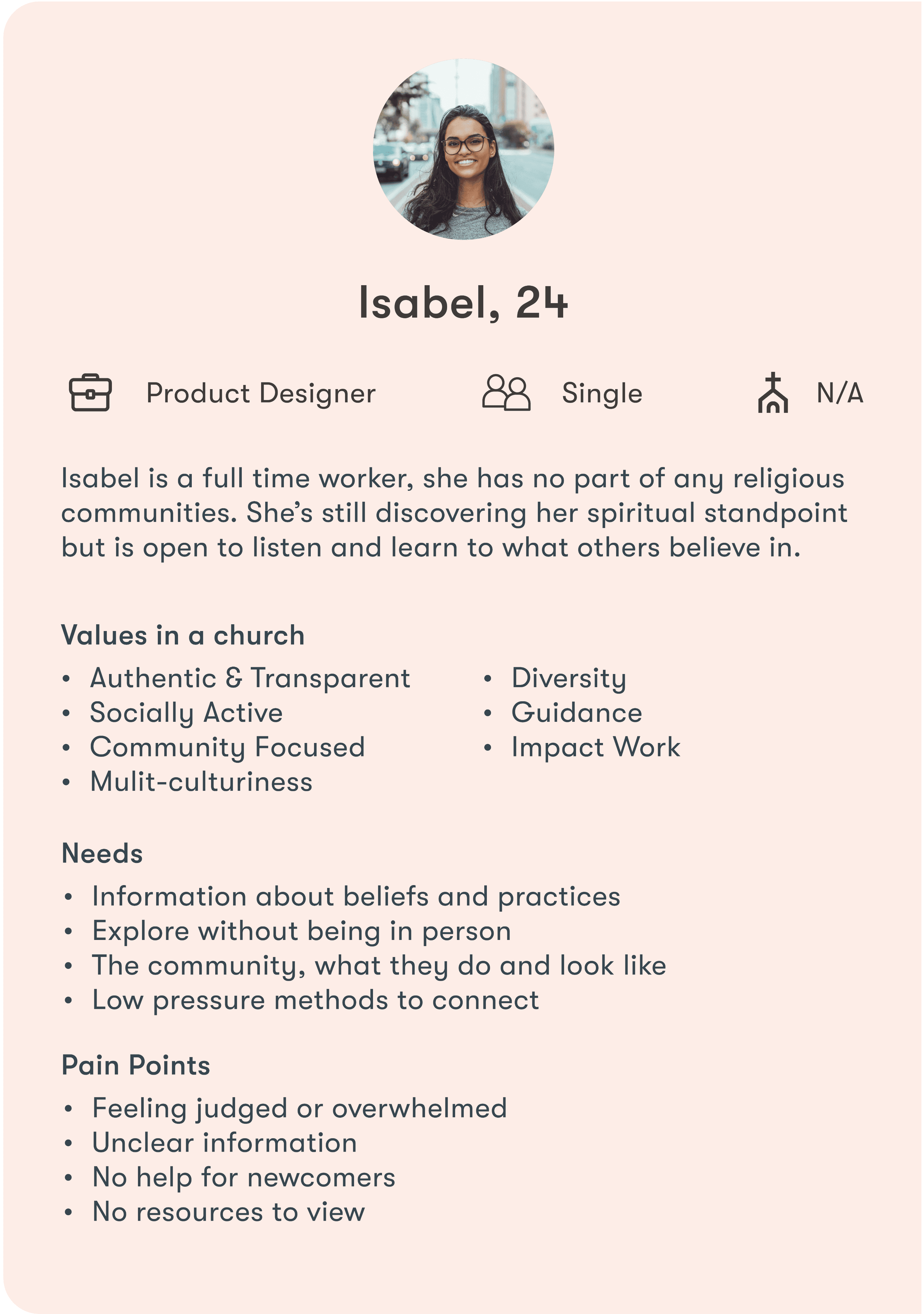
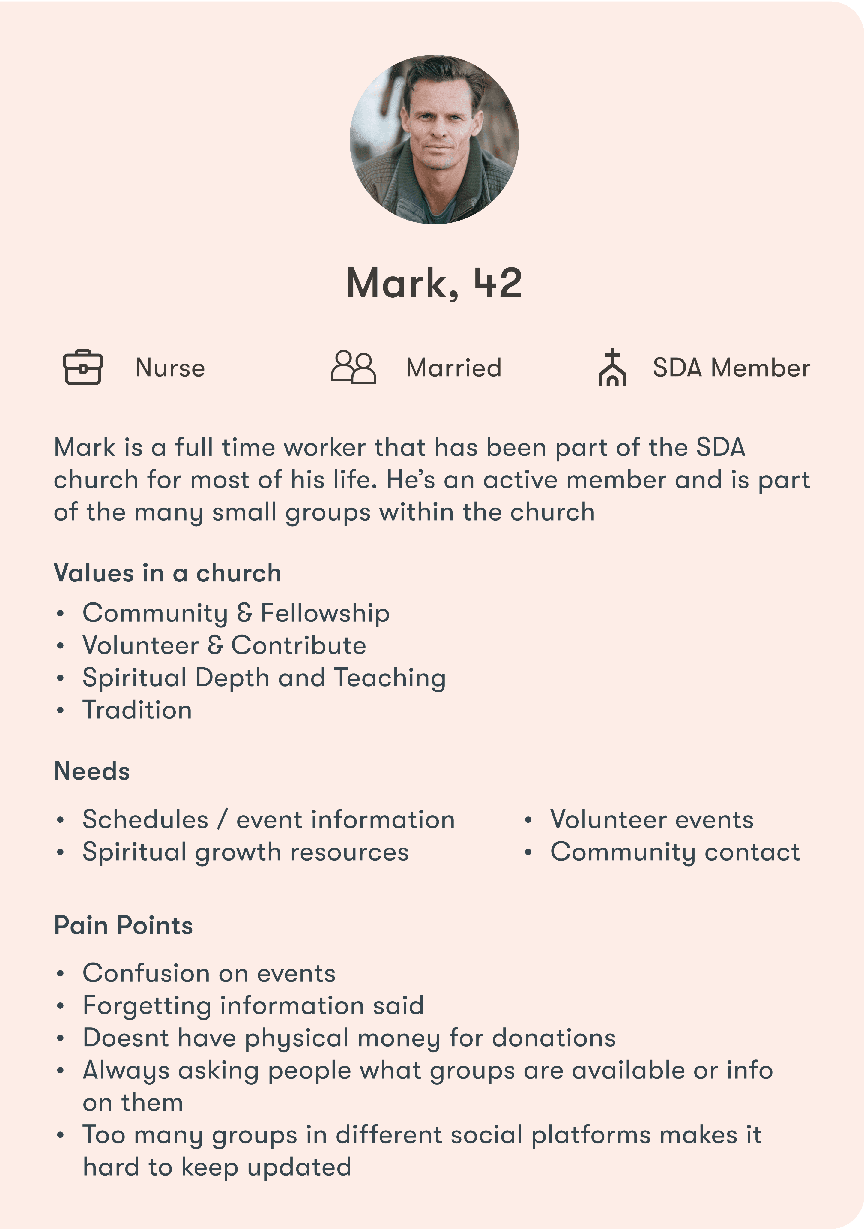
Meet Mark & Isabel. These are 2 personas showcasing the older age bracket and younger age bracket.
Mark & Isabel are personas created by the needs, pain points, experience and motivations of the users in the interviews I conducted.
With the interviews, personas and secondary research in mind, I brainstormed website goals.
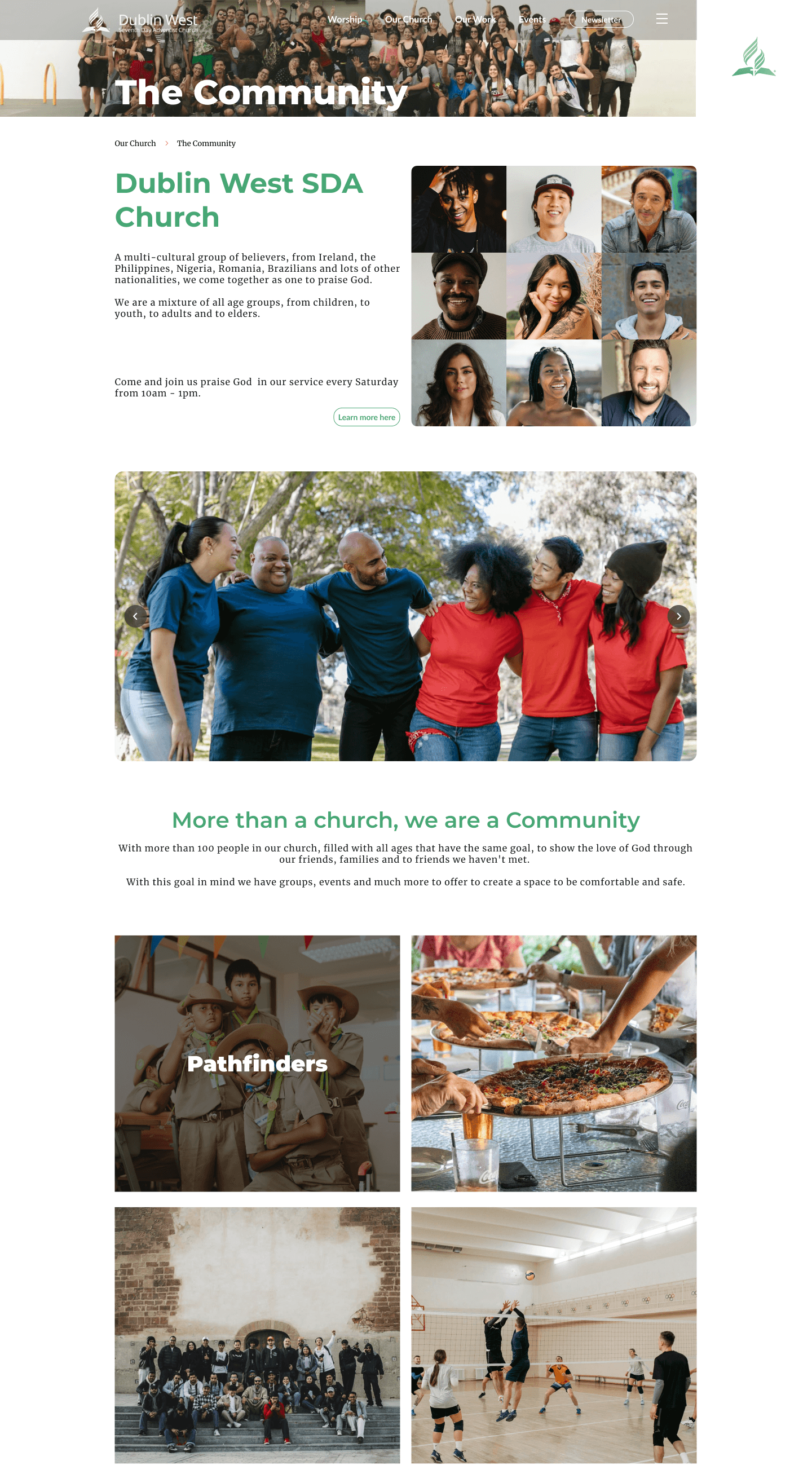
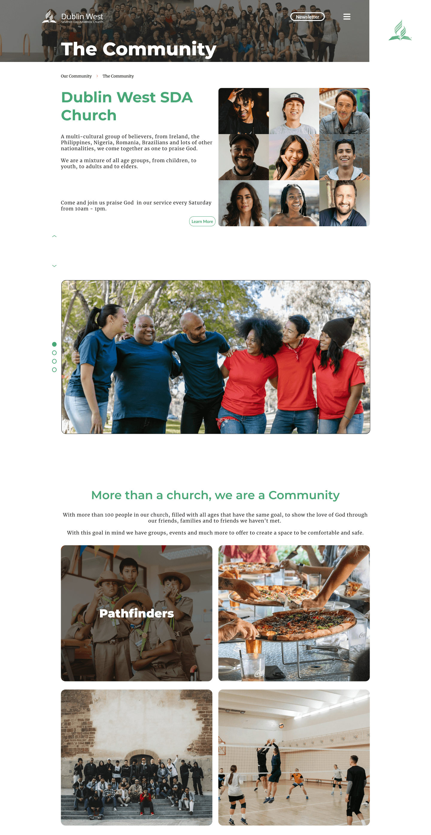
To show different branches of what the church offers such as other websites, groups, our community work and social events.
To share crucial information that responds to the values of new users.
To make what the user is looking for easy.
With the goals in mind, I added features needed to create that goal.
Branching Out
Drop down menu
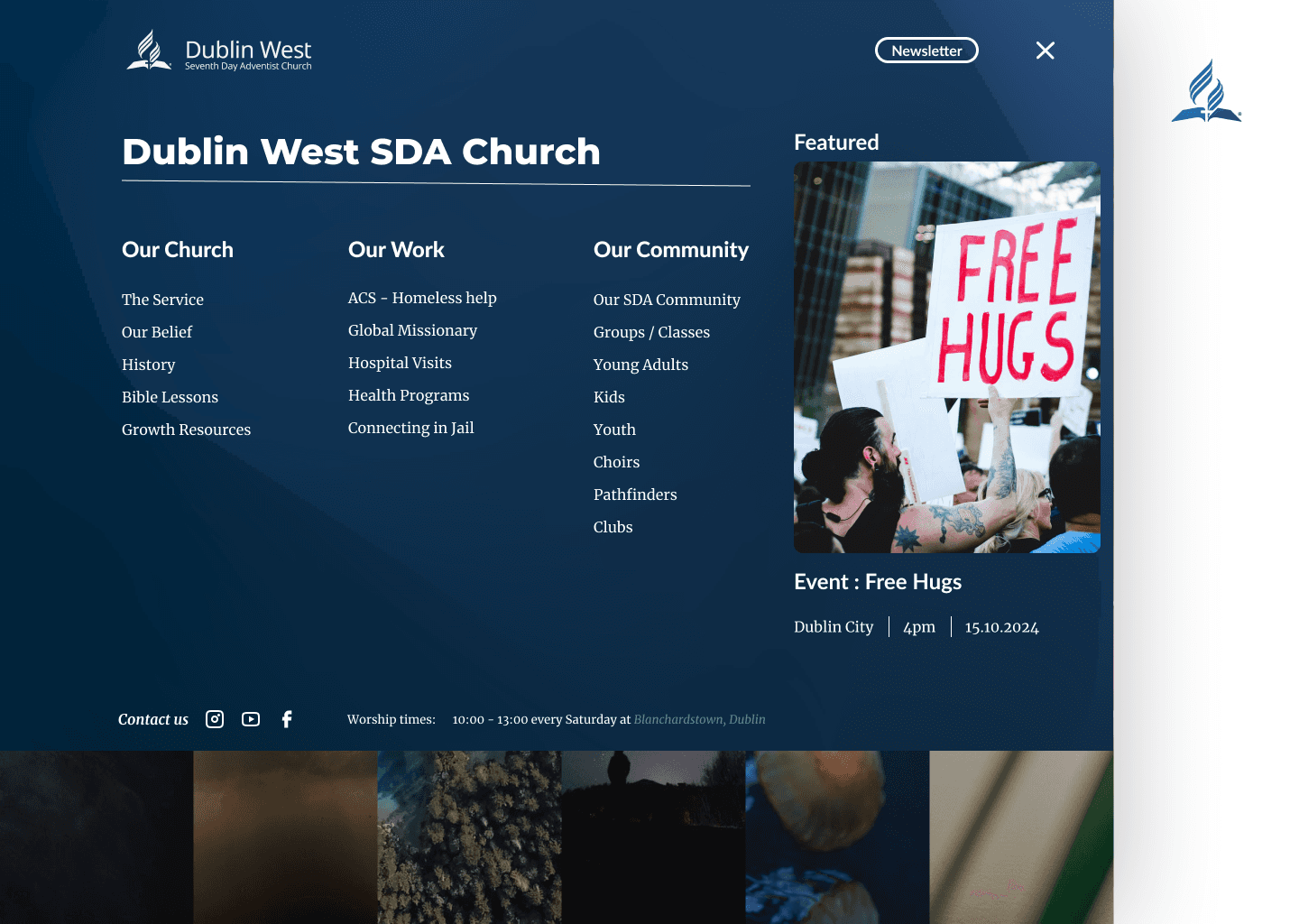
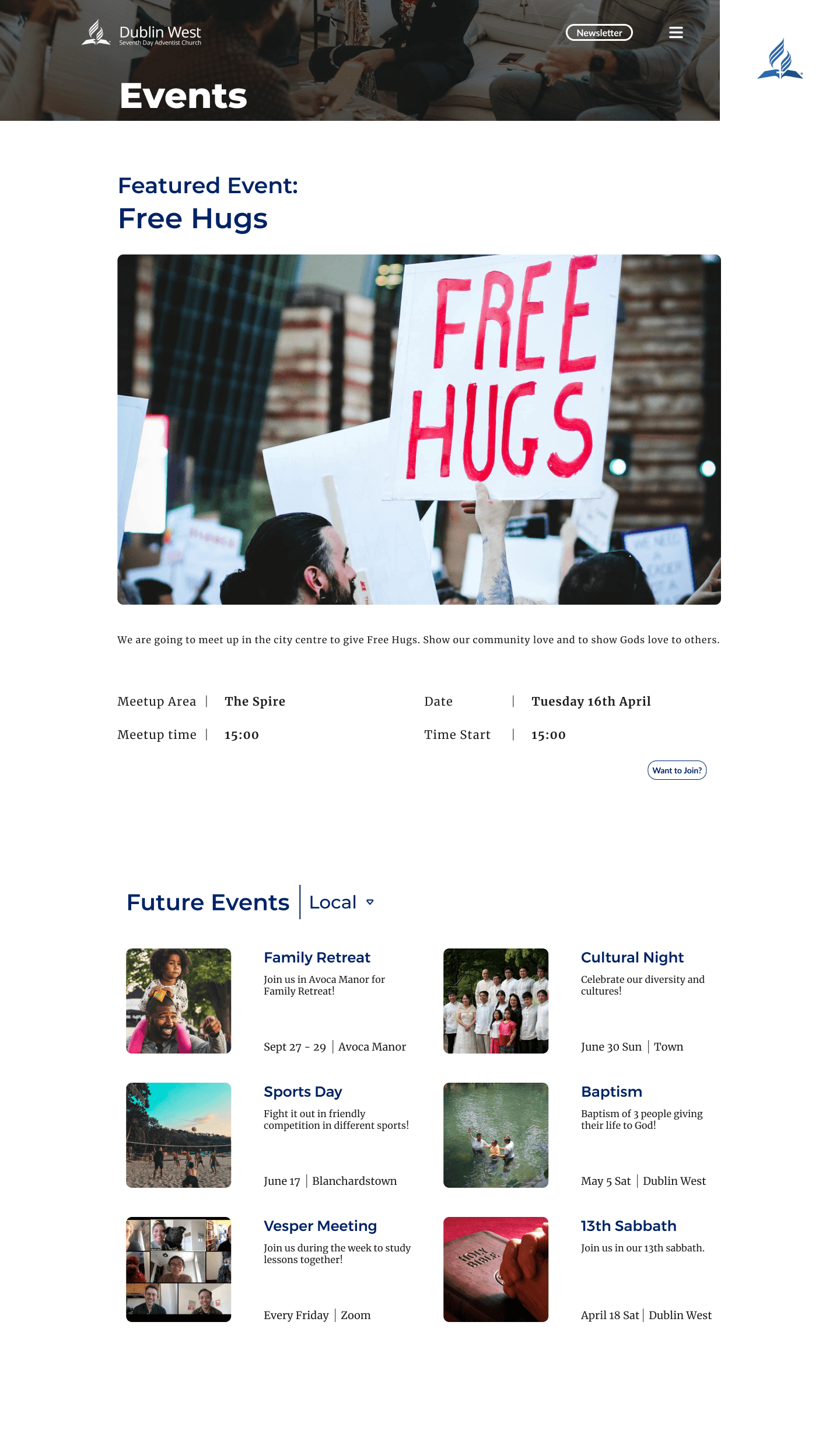
Featured Events
Breadcrumbs navigation
Categorized Events
Information
Events Page
Church Photo Gallery
Church details page - times, meeting place, etc.
Newsletter sign up
Make it easy
3 main entry points ICON - religion, church and community work
Drop down menu
Information Architecture

SDA Church international had a pre-existing visual identity.
The logo has to be in these formats always accompanied with the custom type face of AdventSans.


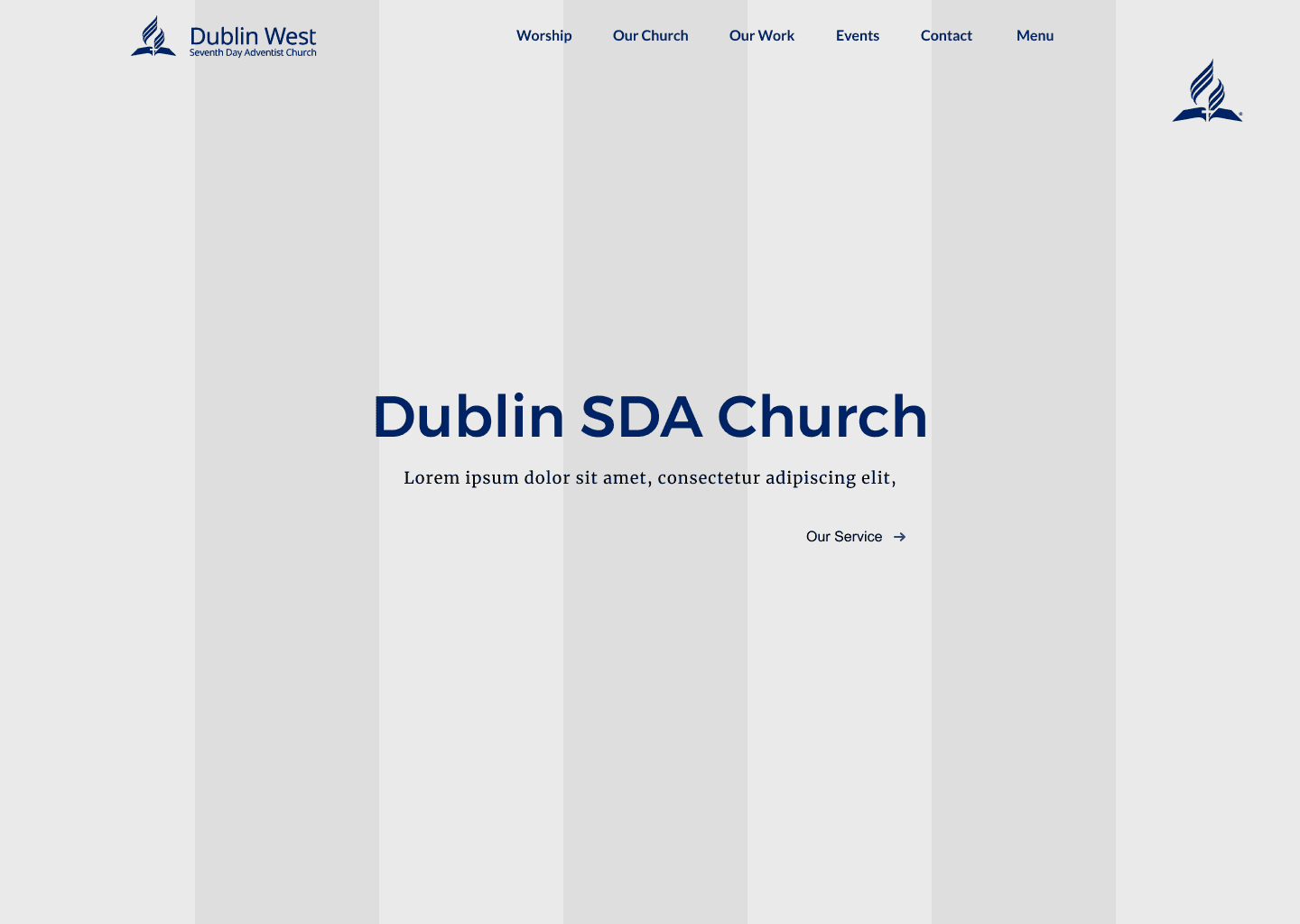
7 Column structure which is to convey the belief in SDA church. 7th column is part of the visual identity of the church.
Space to be filled with anything
While the 7th is untouched.
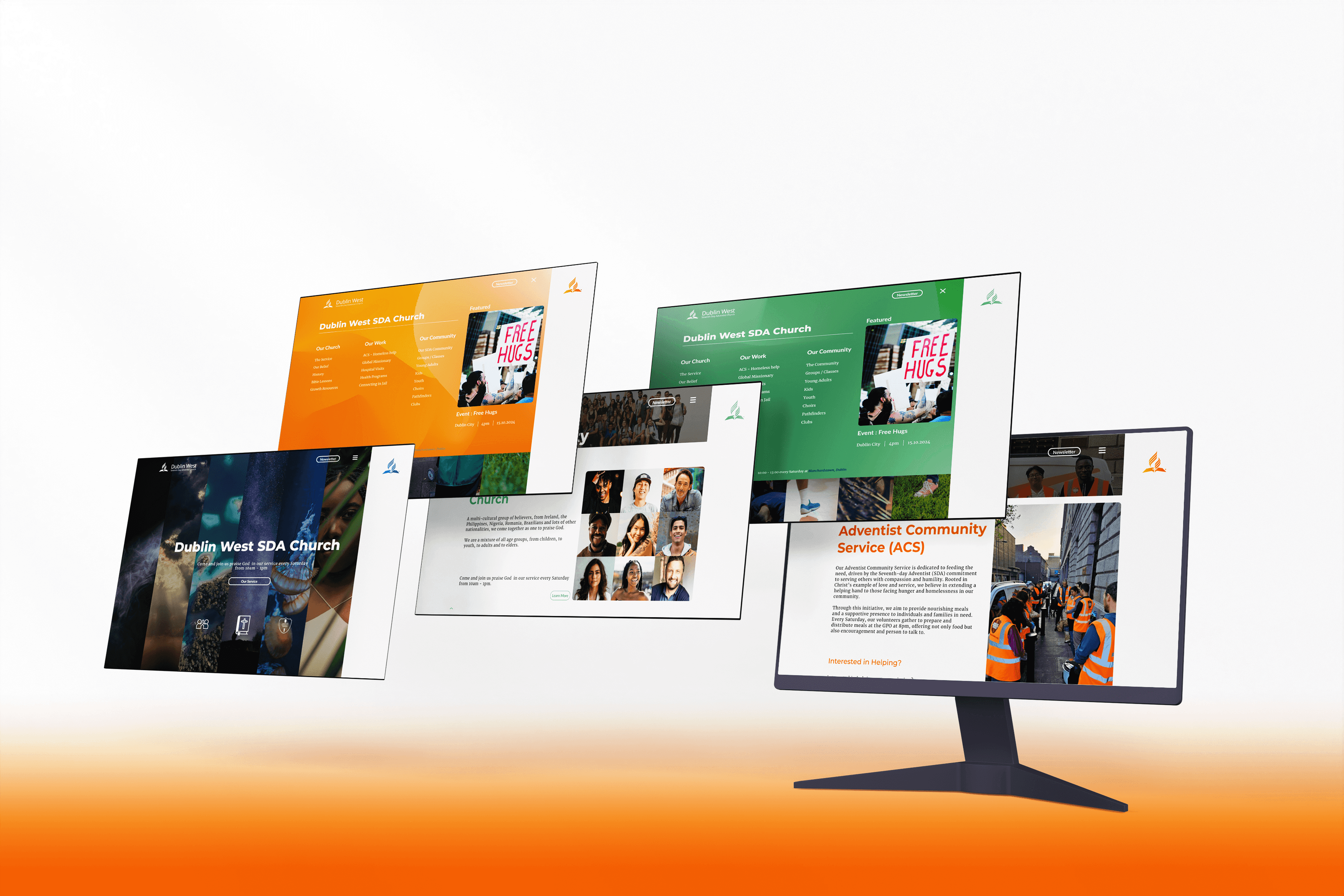
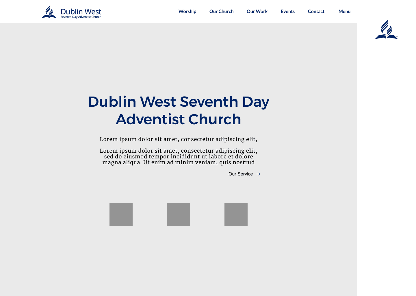
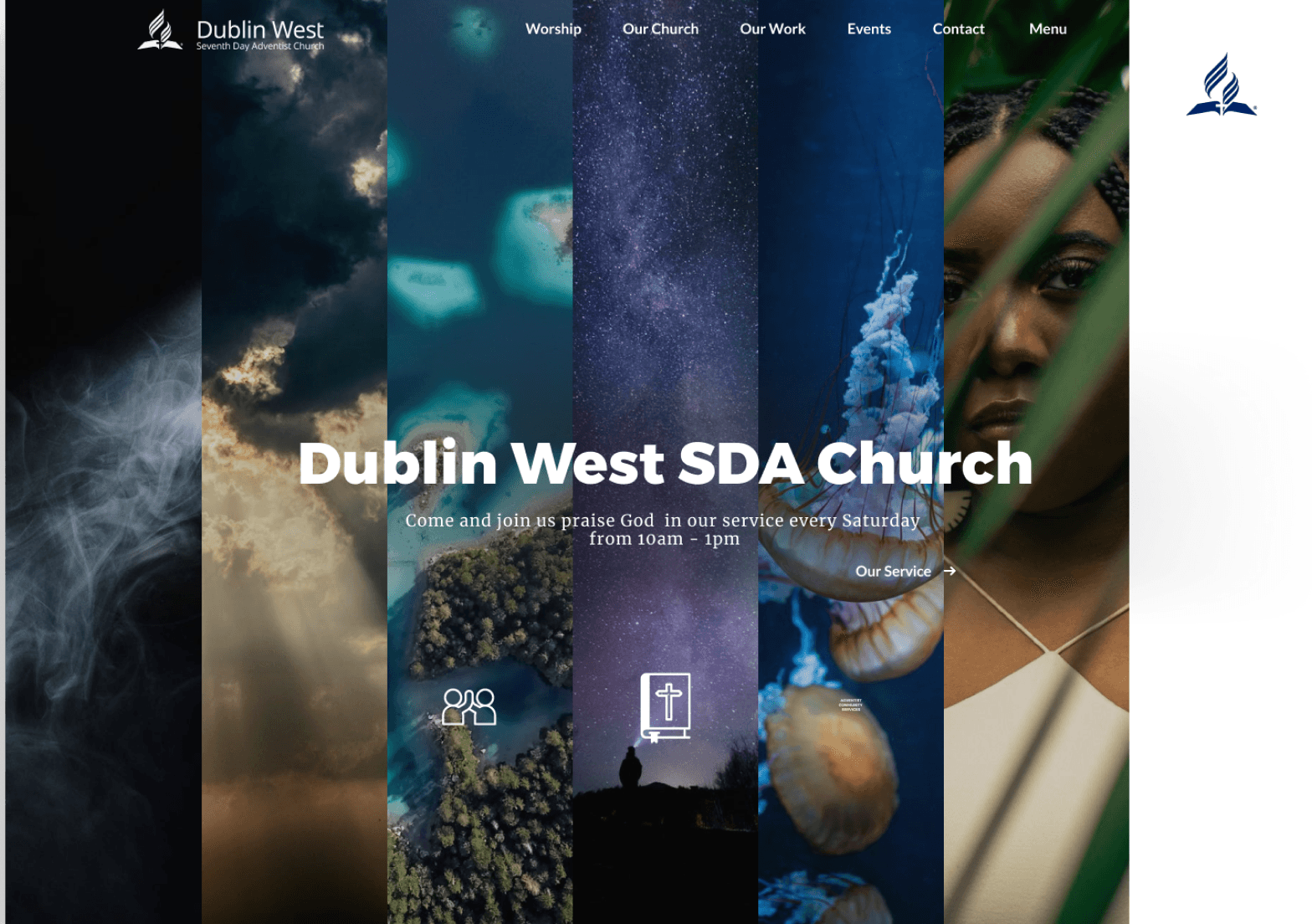
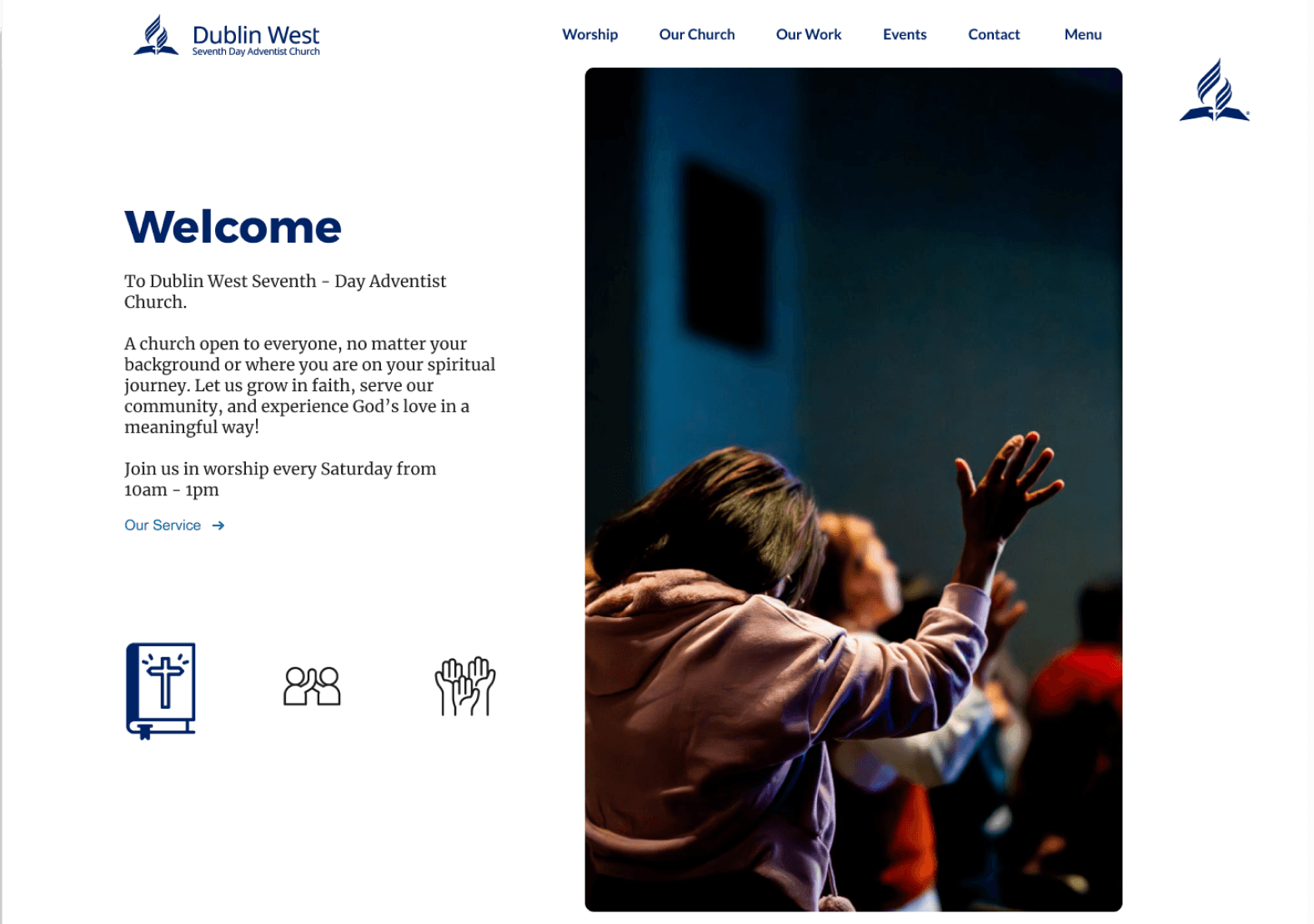
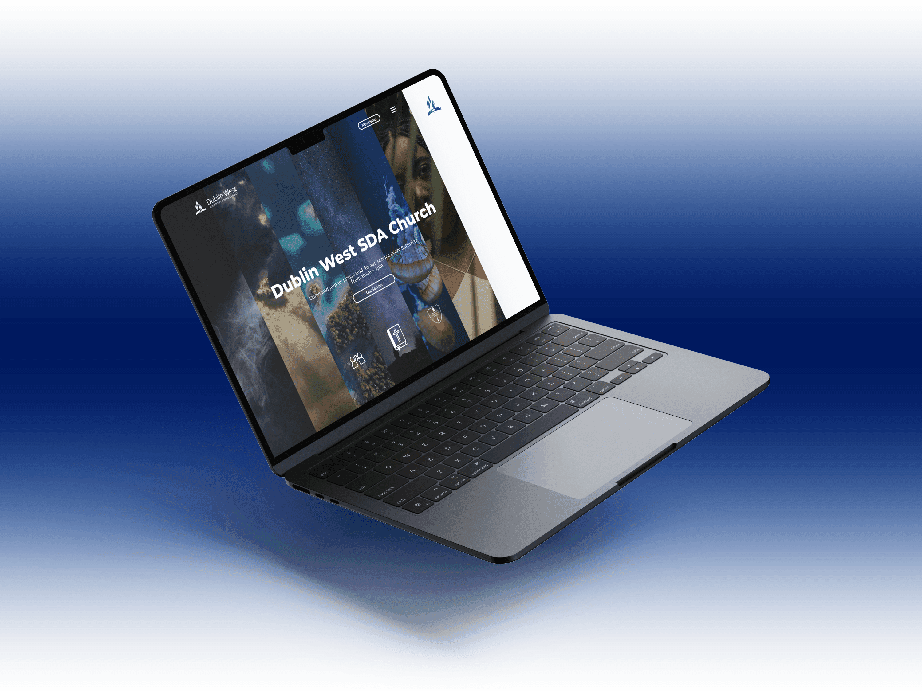
Exploration in what the vibe of the whole website will be through the landing page.
Want to have all the key information be accesible and noticeable while also keeping the minimal style and church identity.


I showed conceptual mid fidelity prototypes to the client to get feedback.


Client feedback - 2 main concepts to be explored. I turned them to semi - high fidelity.


Photos are not final, selected as best photos for reference.

Client feedback - Final concept design selected. Liked the concept of 6 images and blank space representing the 7 day creation belief of SDA.

The people in this test was conducted by 10 people - 5 young (3 non-members + 2 members) and 5 older (2 Non - Members + 3 Members)
The group were demographically ranged so there was different skillsets towards technology, so I wanted to make sure all main flows are straightforward to both parties.
See if the users understand the layout and structure of the website
Make sure the main flows of the website is understood and executed.
Make sure the navigation is seemless and understandable.


The top header, navigational tools, etc weren't as visible to users when switching to different pages. So I removed the tap to a more minimal style, change some of the backgrounds to much darker backgrounds for a better contrast with the words and also changed the ICONS to one colour and a larger size for visibility.

One other small change was the layout of the landing page. It felt too squished in so I decided to split events and SDA ministries.


Another change was to reorganize the menu. There was confusion and overlapping options. It also made the user experience much more clearer since I removed the original navigational feature in the landing page
In the more minimal changes but created impact is the change of spacing. Spacing between content felt too overwhelming to scroll through. Made the content spaced much more to make the experience feel smoother and less overbearing
FAFAFA
1C1C1C
E47000
36454F
002366


ADVENTIST
COMMUNITY
SERVICES
Burger Menu
Home Page
Community Landing Page
Our work Landing Page
Go to
Youtube
Headers -
Montserrat
Main Body Text -
Merriweather
Clickables -
Lato
This project is not fully finished and is still in development. Currently Im looking into brainstorming more features ideas which van be implemented in the user journey through the website. Making the rest of the wireframes that were not included in the main user flows i was highlighting is also in development with the current redesigns in mind.
For the future I would like to do further iterations based on how users respond to the website before it goes live. As for future KPI i would like to see the retention of users based on their search patterns.
Especially in this website where it serves more as an information website and less feature heavy then others, the content mapping was very important for the website to be a good “product” itself. Content Mapping thought me how each section and their sub sections and how they all mesh together to make a a seamless flow for users is meticulous and hard but very satisfying.
A big challenge for me during this project was juggling numerous stakeholder agendas and trying to cater to all the competing needs. For one, I regularly interfaced with the SDA Church to make sure I knew what their desires were for the project and if my solutions complimented their needs. This project gave me an opportunity to learn how to deal with multiple variables and deliver work that satisfied not only my clients needs but also the needs of its 'customers.'